


Gamifying peer learning for student success


My Role
UX/UI Intern for Nuubi’s onboarding process
Timeline
16 weeks
Background
Online learning has extremely poor retention, and massive online learning platforms such as Coursera and Udemy have reported up to 90% dropout rates. So how do we combat this? Well, studies have shown that group learning increase online retention by 16 times. Nuubi’s goal is to add team based learning and gamification to increase participation in classes and course retention, making it easier for both students and instructors. I was tasked with working on the app’s onboarding process! Our goal by the end of the internship was to create an onboarding process with a clear flow to bring users to their dashboard.

Diving into Research
Competitive Analysis
Being current/former university students, my fellow interns and I were very experienced with using e-learning apps. However, we wanted to further study and research Nuubi’s competitor e-learning apps to see the aspects and trends in their onboarding process that we could improve upon in our designs.


Surveys and Data
After doing a competitive audit of our competitor apps, we created a survey and and found participants through “Prolific” to complete it so that we could get a sense of what aspects of the competitor apps were liked or disliked. We also interviewed a few interns within Nuubi to gauge their experiences with the apps. Our criteria for selecting participants included being a student, teacher or teaching assistant who has used e-learning apps before.
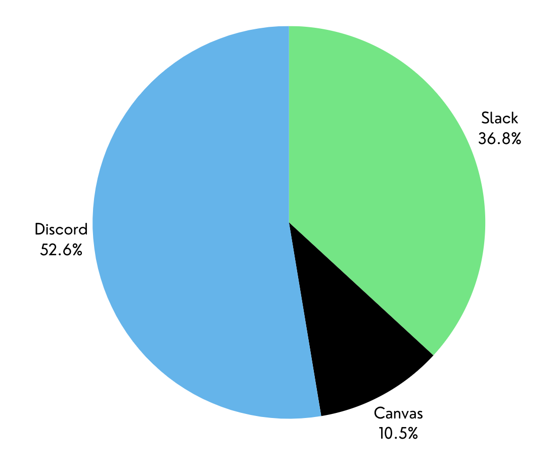
Preferred Competitor App
From our survey we gathered that more interns preferred discord over the other competitor apps

Designs


Most Important Feature

We also learned which aspects of the apps were most important to each person
Affinity Diagrams
Our survey included a free response section where participants could write about key aspects of the competitor apps that they liked or disliked. Using these responses and our interviews, we gathered data points which we categorized into three different cluster groups. This helped us determine which direction to go in designing our frames for the onboarding process!

Insights
After seeing these three major themes, I generated an insight for each one. While creating these insights I noticed that many of the participants in the study expressed the desire to keep several of the elements of our competitor apps present, but also wanted to tweak certain elements to make them unique to Nuubi.
Theme 1: Personalization
Participants expressed a desire to have the ability to personalize their onboarding experience through the use of customizing their profile, selecting goals and interests, etc.
Theme 2: Color Scheme/ Aesthetics
The use of color and imagery in UI elements was shown to be extremely important in keeping users engaged in the onboarding process. An emphasis on neatly designed, accessible, and eye catching visuals and animations which follow brand guidelines is vital.
Theme 3: Ease of Onboarding Process
Users need an easy onboarding process to reduce user drop-off rates. This would include multiple easy ways to log in and sign up, and guided instructions and tips for users during the process.

User Personas
We created two user personas which embodied our target user audience for Nuubi as a whole. We kept these personas in mind when designing our onboarding screens.

Initial Design Ideas + A New Direction
We dug deep into the themes we discovered from our interviews and surveys and spent about two weeks going through ideation phases. At first, we tried to come up with ideas for a demo video we could add to the beginning of the onboarding process, after consulting with the development team, this proved to be a difficult task to complete. Therefore, we switched gears and instead decided to design our onboarding screens with pop-up tips and suggestions that users could view if they had trouble. While our goal was to create an onboarding process that was very simple and easy, we still wanted to make sure users would have a way to get help if they ran into issues.

After creating the user flow for the onboarding process we moved into our wireframing process This process took about 6-8 weeks as we moved from low to mid to high fidelity wireframes. We also collaborated with the other intern teams to create a design system for when we moved into creating our high fidelity prototyping. We made sure to make all aspects accessible.

Phase 1


Phase 2


Hmmm… Lets revisit research for a moment
When we were in the process of creating the dashboard we realized we did not have a solid idea of how to structure it. We knew there were certain elements we needed to include on the dashboard, but we needed input on how to arrange them. We decided to conduct a card-sorting study to see how users organized elements. Our goal was to determine how to group elements on the dashboard so they are easy to locate and navigate through.
Card Sorting
We recruited 15 participants, with each participant completing an individual, unmoderated card sort. Each of the cards in the study had a topic or element that belonged on the dashboard, and participants were instructed to group them based on their similarity.
Insights
There should be tabs to separate class groups and other tasks on the dashboard
A bottom navigation bar would be helpful to separate groups such as chats, post creation, and account settings
Having tasks in its own section and located front and center is helpful when it comes to organization
Leaderboards and accomplishments are related, but should be separated in the interest of organization so one section does not become too cluttered
Major Improvements in Designs
While there were many changes throughout our designing process, these were some of the improvements made, which ended up in our final screens:
Created a tap-through demo on the dashboard which allowed users to gain more information about the app.
Added optional tool tips/help buttons on nearly every page so users could tap to get help if they needed it.
Created a separate page for goals and a separate page for interests after realizing combining them both on one page was too overwhelming.
Added a QR code option along with social sign in options for even more user satisfaction.
We realized there were several edge cases in the sign up/login process! For example we needed to add screens for cases when users forgot their password, used the wrong verification code, or needed to change their password.

We made the process of setting up a profile easier by separating the flow into more screens

An example of tool tips and guides for the user to have a smooth process
The Final Screens
A few of our final screens in our hi-fi prototype!
Home Screen Carousel


Sign Up


Home Screen/Tool Tip Guides


Reflections
This was my first ever UX internship! (Woohoo! 🎉). While I am so proud of myself and my team for the work we came up with for Nuubi’s onboarding process, I am even more grateful for the experience and knowledge I learned from my peers and my mentors :) Here are a few of the things I’ve learned:
Ask questions! I can’t express enough how many times I felt lost and just needed to ask for help from my fellow interns or my team leads. Over the course of the internship I became more and more comfortable with asking questions when I was unsure. I learned that expanding my horizons and seeing the opinions of others really helped in my design process.
Strong foundations are a must! If there was one thing I would do differently in my future projects it would be to do even more research to really understand our users and create the best application possible.
It’s ok to be wrong, and it’s ok to fail. Especially in the initial design stages! There’s a reason why we have so many design stages and reiterations and I just needed to learn to take feedback as one of my biggest resources.
Your peers really want you to succeed! I truly had some of the best people working alongside me and mentoring me. It was so fun to finally work with a team on a design project. I could not have asked for a better first internship experience!
It’s amazing to see how far I’ve come! When I look back at my first UX project and compare it to the work I’m doing now, I feel extremely proud of myself for working hard to improve my work.
* In our prototype, the home button on our dashboard redirects to the start of the app, in the interest of viewing different flows


Phase 3


Set Up Profile/ Choose Goals and Interests


