


Hyacinth Macaw Rescue Group
Promoting the conservation of Hyacinth Macaws through education and outreach
Timeline
8 weeks
My Role
Solo UX designer and researcher
Background
I started this project as the last of three projects in the Google UX Design Certificate Course. The project called for the creation of an app and website for social good. I was inspired by the growing numbers of endangered animals, and I wanted to create an app and website for a fictional conservation group which protects hyacinth macaws, an endangered species. I wanted to provide a way for users to learn about the species and also learn how to help in conserving them.
Hyacinth macaws remain one of the most threatened species of parrots in the world. I created a fictional organization, Hyacinth Macaw Rescue Group (HMRG) which works to raise awareness about the declining population and the ways that the public can contribute to their conservation, which in turn, helps maintain the ecosystem.
Starting the Research
Competitive Audit
I decided to get some background information about similar organizations which were promoting conservation, education, and outreach efforts for other endangered species. I did some research on two such organizations: National Geographic Society and World Wildlife Fund.


There were no direct competitors for my app, but studying these two indirect competitor websites helped me discover what kinds of aspects and information I should include in my designs, and also what I could improve upon. After studying the World Wildlife Fund and National Geographic websites, I decided on a few characteristics which I definitely wanted to include in my website and app designs:
Accessible, engaging content for people of all ages
Consistent brand image across the entire website/app
Playful and bright tone
“Adoption” option to symbolically adopt a hyacinth macaw so users could feel more involved and donate to the cause
Initial User Interviews
I decided to interview 5 people in my Google UX Design Certificate Course about their experiences with websites about the environment and endangered animals. I wanted to gauge their knowledge about endangered animals and what sort of aspects in a website they would like or would make their user experience ideal. These were some of the main points I gathered:


Modifying my Direction
I had originally intended for my website/app to solely be about educating the public about the conservation of hyacinth macaws, but I was getting the sense that users were also interested in more opportunities to get involved in the conservation as well. Therefore, I decided to add more outreach and volunteering aspects to my website/app along with the information about the species and its importance. Users expressed interest in an engaging website/app that was solely for hyacinth macaws so they could learn about them in a more concentrated way, so I knew I needed to create my designs in this way.
User Personas
I created two user personas that represented users I’d keep in mind while designing the HMRG website/app.


Starting the Designs
I began working on the initial wireframes for my designs by first creating a sitemap so I had an idea of what types of screens to include in my designs…
Low Fidelity Wireframes
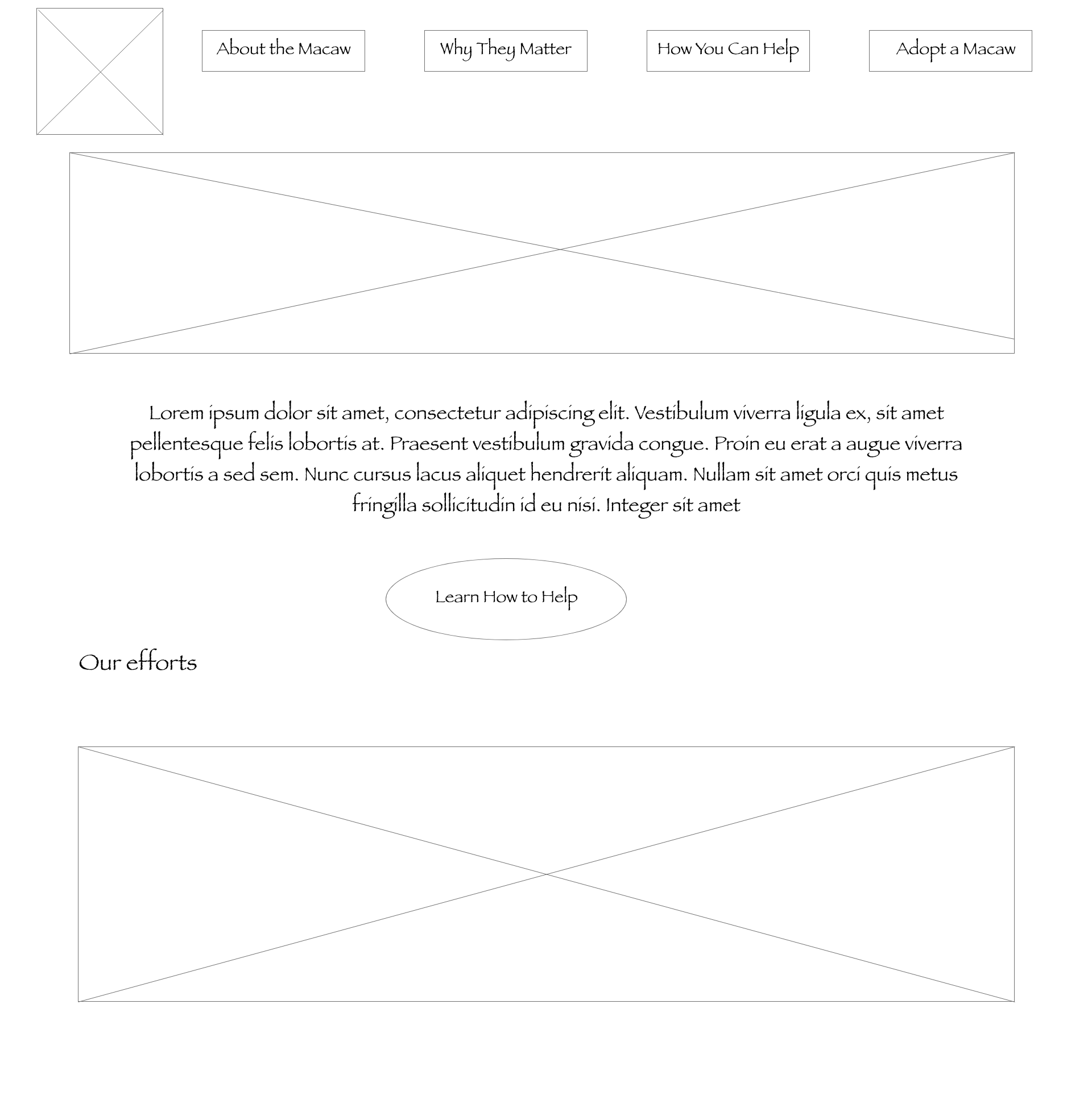
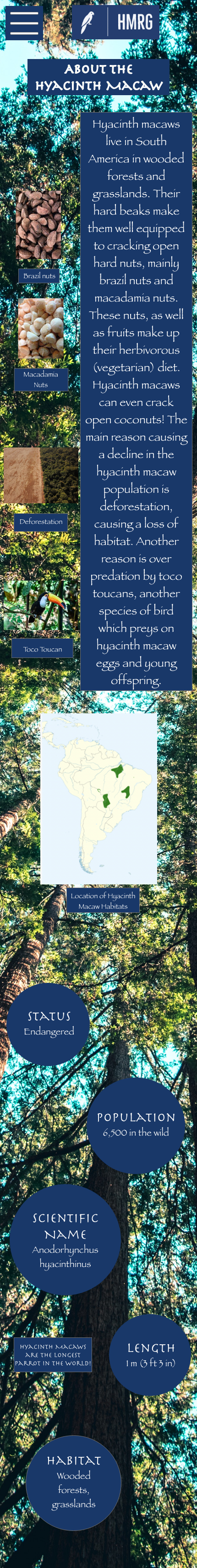
With the help of the sitemap, I was ready to begin creating my lofi wireframes for both the HMRG website and app. I started with paper wireframes and then created digital wireframes using Adobe XD. These designs focused on creating a streamlined, clear flow for the user to find information about hyacinth macaws and the ways they could contribute. Here are a few of the lofi wireframes I created:
Homepage

About the Macaw


Adopt a Macaw


Usability Study and User Testing
I knew that I wanted to test out the flow of my low fidelity wireframes, so I created a lofi prototype with my frames. I worked on getting together 5 people from my program to test out the prototype and see where improvements could be made.

Study Type
Unmoderated Usability Study

Location
Remote

Participants
5 Participants

Length
30 Minutes
Findings
In my study, I had users click through the screens on their own accord to get a feel for the app, and then I had them go through the flow of “adopting” a hyacinth macaw. This usability study turned out to be vital in discovering small tweaks I could make to my designs and well as learning about additional aspects that users would love to be included in the website/app.

Add Socials

Online Adoption

Clear End to User Flow
While going through the prototype, users expressed that HMRG would seem more legitimate if there was a contacts page, or somewhere where users could connect with the brand.
Users expressed that while they loved the “adoption” idea, they were confused as to why there wasn’t a way to actually adopt/pay online.
During the “adopt a macaw” adoption flow, users expressed confusion after completing the task of adopting a macaw, because there was no “success” page to indicate the end of the flow.
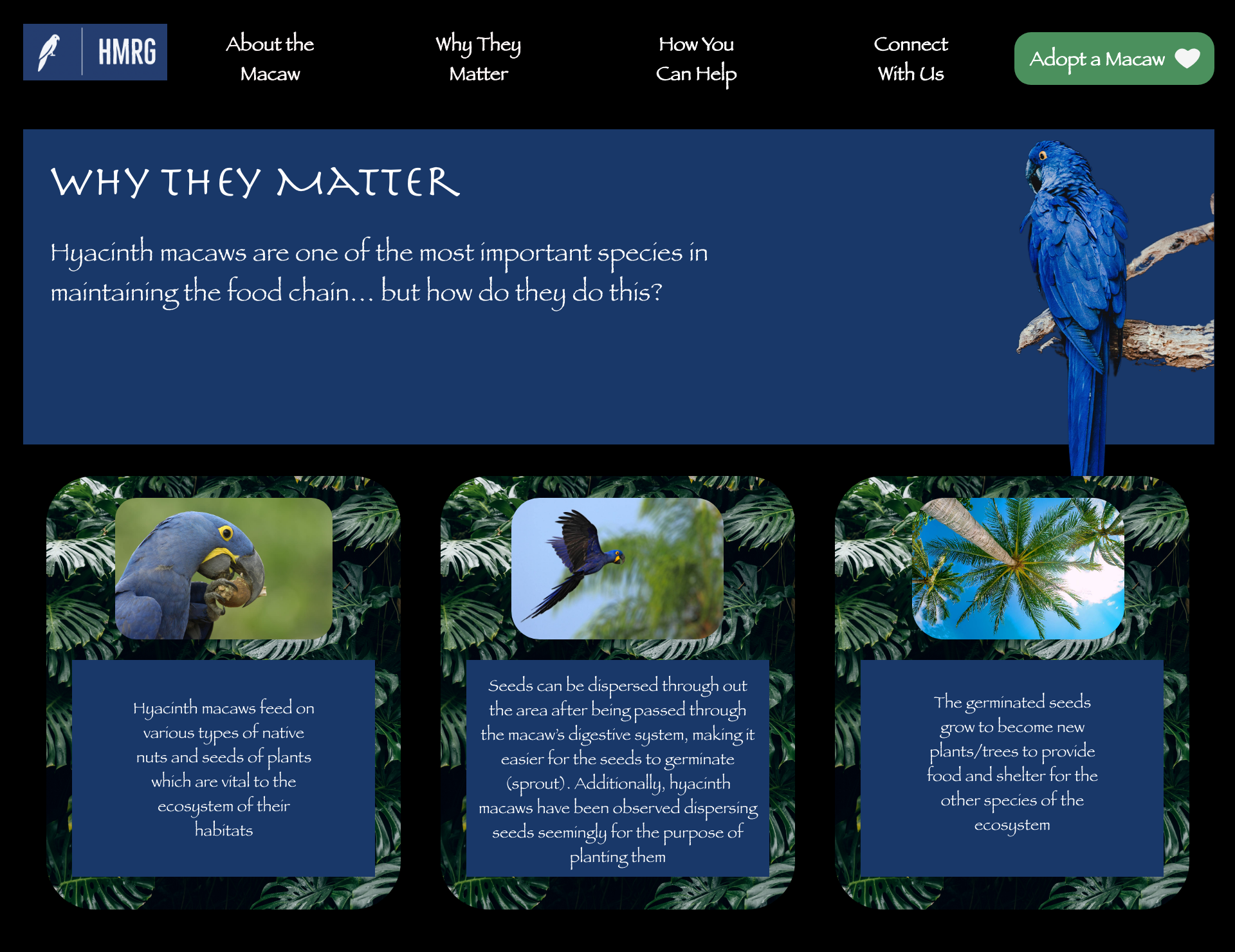
Refining the Designs + High Fidelity Prototypes
Based on insights from usability studies, I applied design changes as I moved on to creating my mockups.
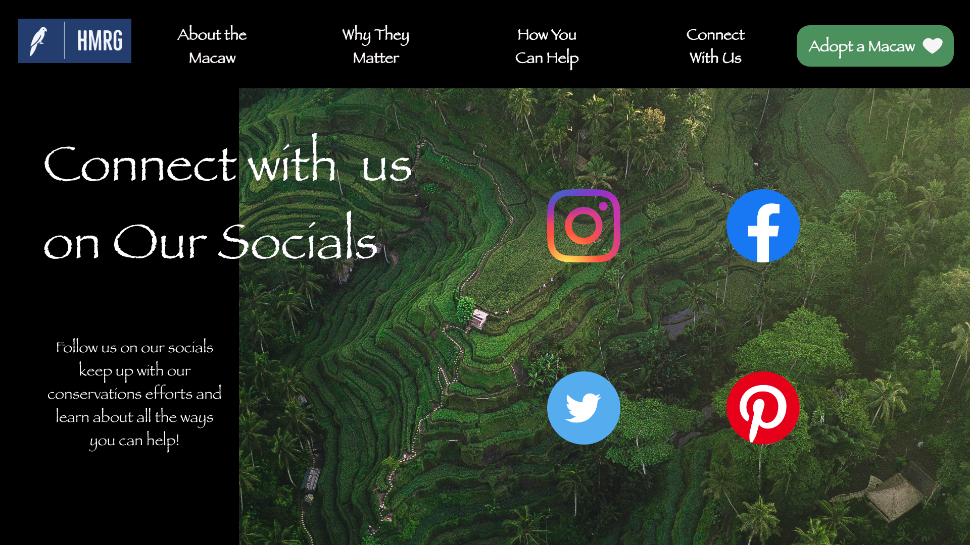

I made sure to include a page with HMRG’s socials so that users would have a way to keep up with the organization’s efforts or volunteering opportunities


I added an online payment option so that users who wanted to “adopt” or donate could do so directly on the website or app


I created a success screen so that users who go through the process of adopting a macaw will be aware of when they have successfully submitted their payment
Additional Final Screens


View Full Prototypes!
Going Forward
I believe that this is just the start of HMRG’s website and mobile app. There are so many other ideas I have to make the experience even better for users. As I went through research and user testing for this case study, I found that keeping the user experience engaging and interactive seemed to be a major goal. Going forward, I believe adding a notification feature for new volunteer opportunities would be great for keeping users engaged. Additionally, a tracking feature for those who symbolically adopt a hyacinth macaw would be a good idea. This way, users feel more involved in conservation and can actually get updates about what their adopted macaw is doing in the wild. If I were to keep this project going, I would love to do more user testing to gauge interest in these additional aspects.
Reflections
This was the last case study in the Google UX Design Certificate! Another milestone: ✅! I’m very proud of myself for creating this project from start to finish, and it was really fun to work on both a mobile app and a website at the same time. I’ve always had a passion for endangered animals, so creating an entire website and app dedicated to the conservation of an endangered species is sort of a full-circle moment for me! Here of some of the things I’ve learned while working on this project:
This was the project where I really decided to gain inspiration from UI elements in other designers’ work. I feel like I pushed myself to create a visually pleasing mobile app and website.
User testing is SO important! There were so many things in my designs that I wasn’t noticing as a designer… but they became very apparent when others were going through my prototype. I’m grateful to have had peers in my course who gave genuine feedback.
So many resources! There was quite a bit of imagery and icons I included in my designs, and I found so many amazing tools and websites for resources as I went down a rabbit hole trying to find design tools.
I’m very excited to see where my UX journey takes me next, now that I have completed the Google UX Design Certificate!