Responsive Website for a family owned bakery!
My Role
Solo UX Designer and Researcher
Timeline
7 weeks
Background
This was the second of three projects I completed as part of the Google UX Design Certificate. For this project I was tasked with creating a responsive website, and I chose to create an online ordering system for a fictional bakery. This was a special project to me, since the fictional bakery is based on my college town’s very real bakery with the same name (Baked!)! I was inspired to create this online ordering system website as my second project because I remember the struggle of my college town’s bakery not having one of their own. I wanted to provide a way for user to browse the bakery’s menu and order online, so they could pick up in store instead of waiting in long lines in-store
The Problem:
Baked!’s lack of on online ordering platform causes long wait times and unhappy customers and employees
The Goal:
Design a Baked! website which includes an ordering feature which is user friendly and offers a fast, efficient checkout process
Understanding the User
Initial Interviews
I conducted user interviews in order to better understand the target user and their needs. I discovered that many target users lead busy and hectic lives, and usually visit bakeries and coffee shops for a quick pick-me-up in between their busy work schedules. However, many bakeries are extremely busy during peak times and without a way to order online, getting a quick drink or snack becomes very difficult. Additionally, some of the ordering platforms which do exist are very confusing. This irritates target users, since what should be an uplifting experience is instead frustrating. Here are the major user pain points I gathered from interviewing my peers:
Time
Navigation
Interaction
Users don’t have enough time to stop in a bakery to wait in line for their orders
Current online ordering platforms for bakeries are confusing and seem “busy” so users don’t feel like using them
The interactive elements of online ordering platforms are not engaging or cohesive, so online ordering experiences are not memorable
User Personas
After gaining some insight on user pain points and needs, I created a user persona that represented users I’d keep in mind while designing Baked!’s website:
User Journey Map
I created a user journey map so I could get a better idea of the steps a potential user would take when ordering from Baked!’s website.
Starting the Designs
Before working on my lofi wireframes, I created a sitemap which would guide me as I created my initial screens
Low Fidelity Wireframes
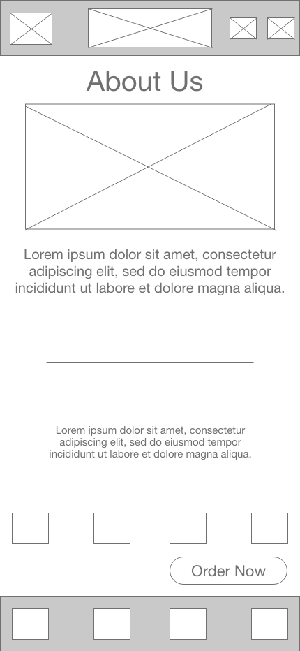
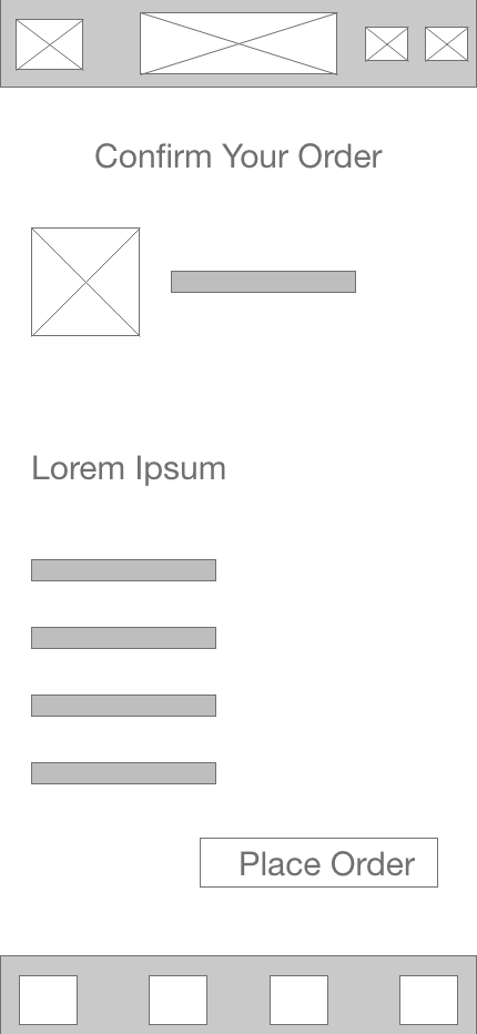
Using the sitemap as a guide I moved on to creating some lofi wireframes for desktop and mobile view. As I designed, I remembered all the feedback I received from my interviews. I kept the user in mind throughout the wireframing process, prioritizing the addition of useful button locations and visual elements that were clear.
Homepage
About Us
Rewards
Login/Sign Up
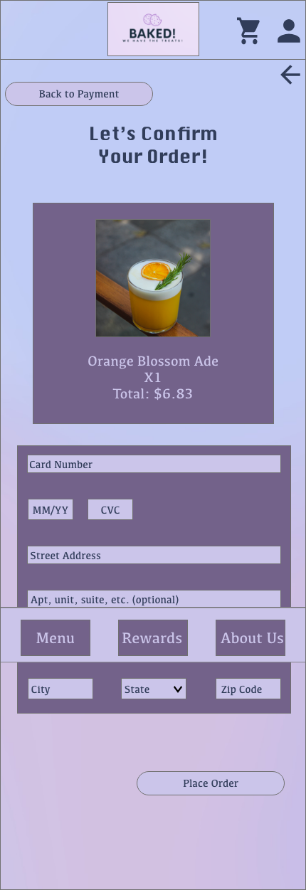
Order Confirmation
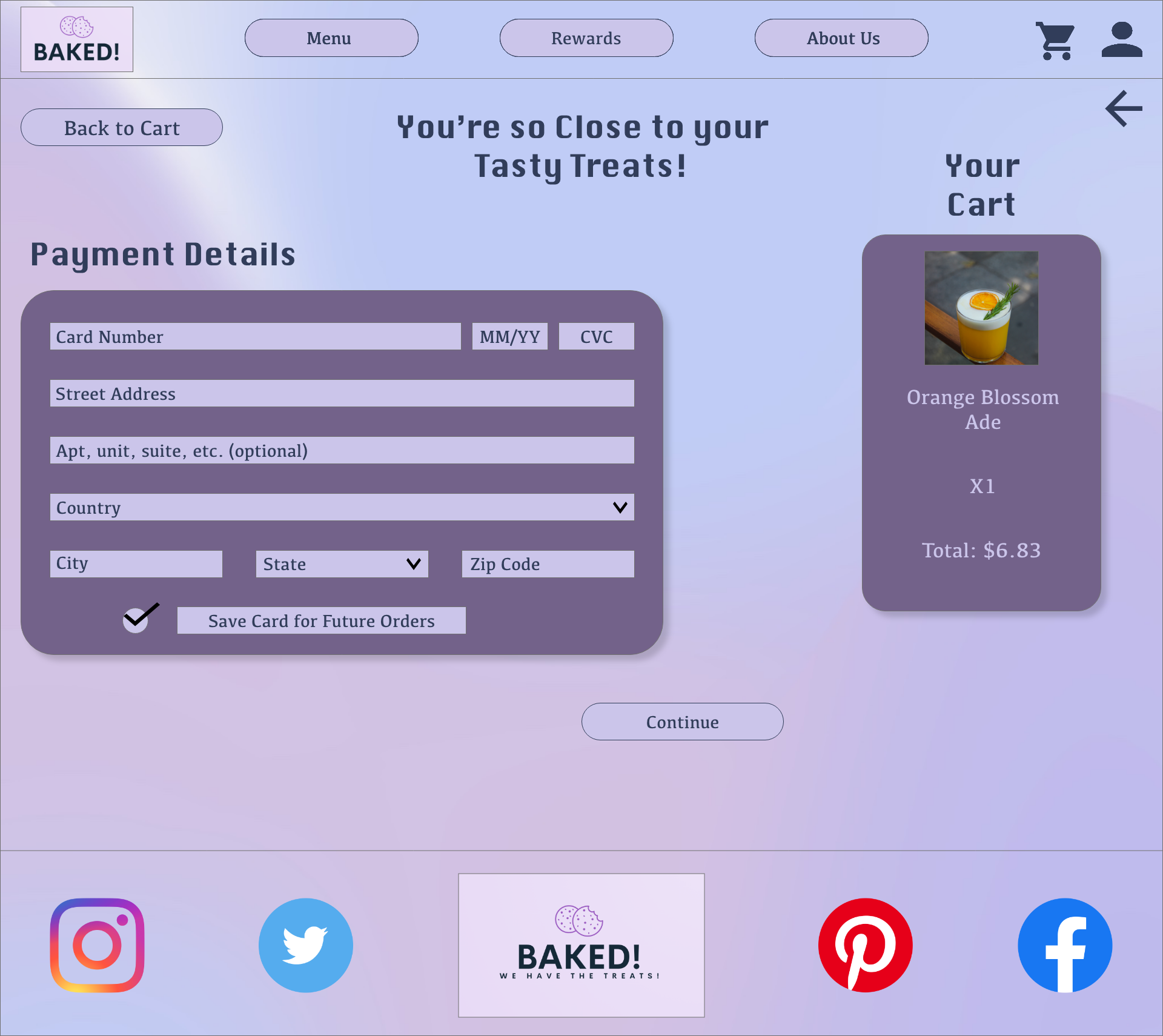
Payment Details
Usability Study and User Testing
With my lofi wireframes complete, I wanted to conduct some user testing to see where I could make improvements. I organized an unmoderated usability study with 5 people from my certificate program so they could test out my designs.
Study Type
Unmoderated Usability Study
Location
Remote
Participants
5
Length
30 minutes
Findings
For this usability study I had participants go through the flow of ordering a drink from the Baked! website. I also had users click around on the website to explore the rest of its pages. After gathering feedback from them about their experience with my design, I found that there were a few changes/additions I could make for my website:
Menu
Checkout
Arrival Time
Participants expressed frustration after realizing when they selected an item from the menu, there was no option to select a quantity or size before moving on.
During checkout, participants found it frustrating that there wasn’t an option to save their payment information.
Participants expressed the desire for an estimated wait time to be given after successfully placing an order.
Refining the Designs + High Fidelity Prototype
Based on insights from my usability study, I got to work on modifying my design layout as I worked on my mockups. After choosing an accessible and visually appealing color scheme, my first task was to implement the three major insights I gathered from the usability study.
I made changes to improve the site’s checkout flow by adding a popup overlay so that users could choose the size and quantity of the item they selected, using a “+” or “-”
To make the checkout process even easier, I added a checkbox to allow users to save their payment information for future orders. In the usability study users said this would encourage them to return to the website to order from Baked!. I also added a sidebar so users could view which items were in their cart at the time of payment.
Users expressed that having an estimated wait time would create a much better user experience when ordering from Baked!, so I added a wait time to the success screen so customers would be able to know when to come in to pick up their order.
Final Screens and Prototyping
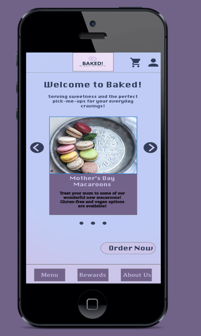
I then moved on to creating mockups for the rest of my screens and prototyped them to create my high fidelity prototype. Here are the rest of my high fidelity screens:
Homepage
About Us
Rewards
Sign Up/Join
Cart
Confirmation
View Final Prototypes!
Going Forward
With this project being a responsive website, I would definitely like to try to design for more screen sizes and test these out with users in the future. If I wanted to expand the research for this project I would love to do more testing to see if my designs actually produce a quicker, more efficient checkout process than other cafes.
Some additional features I think would be great to add to Baked! in the future would be a scheduled pick up time for orders. Since we are trying to accommodate the busy schedules of our customers, this option would help cater to their needs. Additionally, in order to appeal to customers with dietary restrictions, the addition of a button that can be clicked which filters menu items would be beneficial to help users narrow down their options.
Reflections
This was a really special project for me to complete because it was so reminiscent of my favorite bakery in my college town! I’m very proud of myself for creating this project, and it was definitely one of the more time consuming projects, due to the number of screens I needed to design. Here are a few things I learned while working on this project:
Adobe XD is so wildly different from Figma! This was my first project using Adobe XD and I definitely think I was little too comfortable using Figma… I was definitely excited to learn using a new tool though!
Online tutorials are SO helpful! I ran into quite a view issues because I had a design idea in mind but had no idea how to bring it to life. Several online tutorials helped me work my magic and put my ideas into Adobe XD successfully.
Design ideas come so much easier when you’re really passionate about something. I feel like my creative juices were really flowing with this project because of how much I really liked the concept!
